Hello Toons, Aero here! I work as a brand artist and graphic designer on the Corporate Clash Crew. In the past two years that I’ve been part of the team I’ve primarily worked on social media graphics and other miscellaneous brand projects, but in my opinion working on the Hires & Heroes logo is the biggest project I’ve done yet, both in terms of difficulty and importance. This is my first ever Backstage post for Corporate Clash, and this will be the first in a series of Backstage posts aiming to encompass all the shiny new content brought to you by the crew for the 1.3 update!
Ideas & Initiative
The 1.3 update had several proposed names that tried to capture the scope of everything new being added, both Cog-side and Toon-side. “Hires & Heroes” won out against 7 other names in the end, but I’m fond of a couple other suggestions that were made such as “Social Security” and “Helping Hands.” Once the team had finalized the official name of the 1.3 update, the call went out for any graphic designers interested in creating the logo, and I stepped up to tackle the project.
At the time I don’t think I fully appreciated how daunting it would be to make a logo that captured the essence of such a jam-packed update, and I definitely had to step out of my comfort zone to reach the final result’s level of complexity. The logo was to be featured in the “v1.3.0 Informational Video” releasing about a week later, which meant a quick turnaround time. From the get-go I wanted to feature some sort of opposing or mirroring motifs in the logo’s design, something to stress the strengths of both the “Hires” and the “Heroes.” In hindsight I feel like this may have actually been a limiting factor in my development process, but more on that later…
With only a week to put something together and a general direction in my mind, I got to work on a couple ideas. I had been somewhat out of the loop on 1.3’s development at the time, particularly regarding the new Cog manager bosses, and I asked for some shots of each that I could use to feature in the logo. The design I had in mind would feature side views of two or three manager bosses and Toons each. Chainsaw Consultant was noted by other staff as having a very distinct side profile, and Duck Shuffler also stuck out to me for the strong zany personality communicated in his design, which was perfect for offsetting the more serious Chainsaw (fun fact, I also considered Pacesetter in Duck’s place). On the Toon side of things there were also returning character Doe Vinci and her brother Bro Vinci arriving to helm 1.3’s new club system, and I thought they would be perfect for balancing the composition of the logo I had in mind. Along the way I also added in the newcomer Gag N’ Go owner, Reid Stock, in case I needed to fill space on the Heroes side.
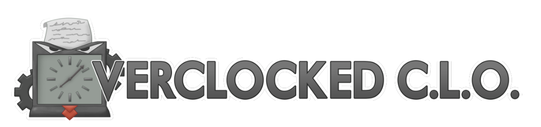
At this point I took some inspiration from 1.2’s Overclocked C.L.O. logo, done by fellow graphic designer Wintrie. I was drawn to the simplicity of it, a distinct illustrated object accentuated by precise typography. In my own work I’m a “less is more” designer, more or less, and it’s my default setting when I have to design a logo. While working with Corporate Clash has pushed me to do more detailed work before, given the time constraint I figured I had little choice.
Hmm. That looks quite a bit different from the logo you’re familiar with, doesn’t it?
The general reception ranged from positive to lukewarm at best, primarily citing the design as being too simple, and the logo was thrown out so I could go back to the drawing board. The debut of the Hires & Heroes logo was pushed back to be featured in the official 1.3 trailer, which was being developed simultaneously.
This now gave me a couple months to work with as opposed to a week. I went back to sketching.
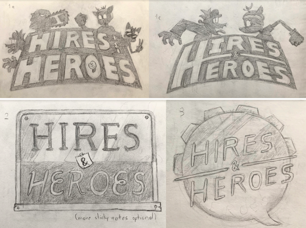
I found myself focused on that idea of opposing sides like before. I felt like the update name lent itself perfectly to such an idea, and yet I couldn’t quite get any designs to stick no matter how I chipped at it. I went through about ten more sketches, four of them featured above. The first two were different takes on my initial idea (an arrangement of sharp, distinctive lettering and silhouettes of the prominent characters I mentioned earlier). The latter two were attempts to move away from that concept, focusing more on the actual gameplay additions (new Cog mechanics and the revamped club system/chat UI, respectively).
I was going to submit my sketches for review, but something didn’t sit right with me. I found myself studying sketch 1c a lot. Though it wasn’t my favorite of the selection, something about it was intriguing. The way Duck Shuffler and Doe Vinci were squared up created a tension that wasn’t present in the other
designs. It was similar to my own tension I felt in trying to reconcile all the ideas I’d had up to this point, getting visually opposite sides to work together.
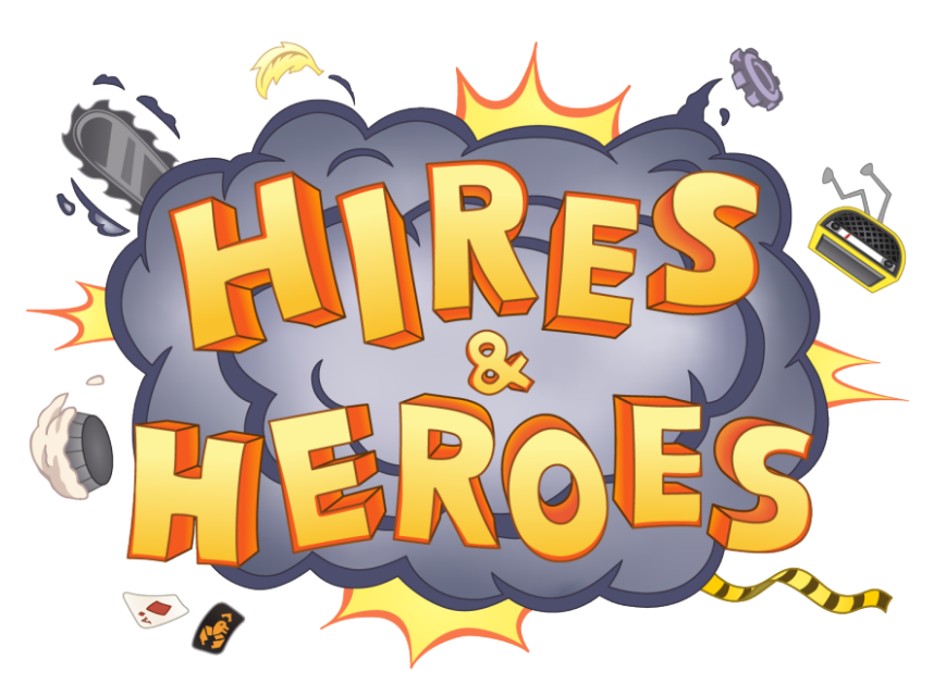
After staring at sketch 1c for a while, I imagined fast-forwarding half a second later to the outbreak of the fight built up by it. I had the perfect cartoon visual, the classic debris-filled dust cloud. It didn’t have any fully identifiable characters in it like I had previously wanted, but this design gave me plenty of room to reference a few managers (Chainsaw and Duck as before, but also the newly redesigned L.A.A.) in the props surrounding the cloud. Adding a few of the Toons’ gags, including the new Broken Radio, made sure both Cogs and Toons were represented in the brawl. I even got the distinctive lettering I wanted, now depicted in 3D to fit the energy of everything else.
The response to this design was very positive and felt like a big win. For me graphic design is all about using art to solve a problem, and finding that ideal solution makes the sometimes arduous process worth it. While the project was only half done, I feel the conceptual phase is more often than not the most difficult part of getting a design right; if I don’t nail down exactly what I want during this phase, any large corrections further down the line become much more difficult. But if I perfect the concept and sketch, everything that follows on top is much easier.
Colors & Contrast
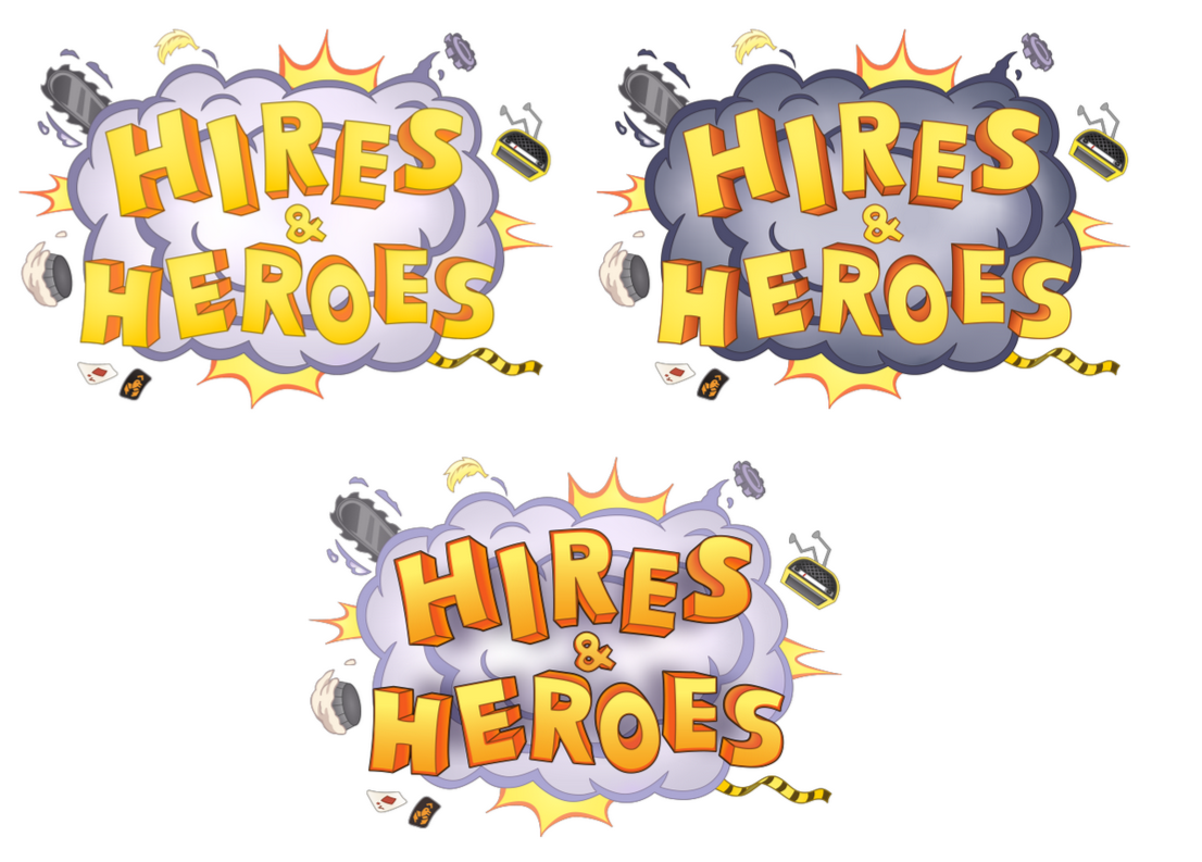
With the hardest part over, I got to rendering the real thing. I created the logo as vector art, which is the standard for logo designs as vector files can be scaled as big or small as needed. I took some inspiration for the color palette from Corporate Clash’s current logo, which combines warm colors with more mechanical tones. I went through several variations trying to perfect the balance of light and dark colors with the guidance of fellow artists on the team, pictured below.
For the final product I wound up keeping the darker cloud and red-highlighted lettering from earlier versions. There’s not a whole lot for me to say about this phase of the project, but I’m proud of the result. I feel I really had to get out of my own head to pull off the final logo, and I hope to keep improving and contributing to Corporate Clash’s future.
And that brings us to the end of this Backstage post. But not to worry, there’s plenty more to come soon! A lot of work went into this update from every team on the crew, so make sure to keep checking back here or on Corporate Clash’s social media for updates. See you soon!